Enjoy
QIA
Finance
UX Design
UI Design
Introduction
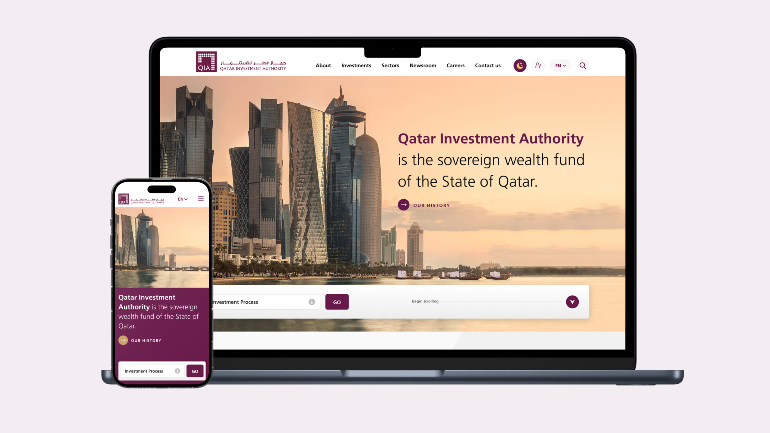
QIA is one of the biggest wealth funds in the world. it represents $475 billion of assets under management. Making it one of the top 10 wealth funds globally. I had the pleasure of working on their website in a full intensive design cycle to produce the best possible experience for their highly net worth users.
Design Activities
(Activities with * will be shown in the case)
Competition Analysis
Stakeholders Survey Workshops*
Persona Survey & Persona Construction*
Card Sorting Workshop & IA*
Content Strategy
Wireframing*
Website Design*
Dark Mode & Mobile Design Version*
Note:
Please don’t consider this case as a full presentation of the work done on the project in the entirety of its details. This is just to give a general look & to serve as a proof of portfolio for the project that I worked on with other team members.
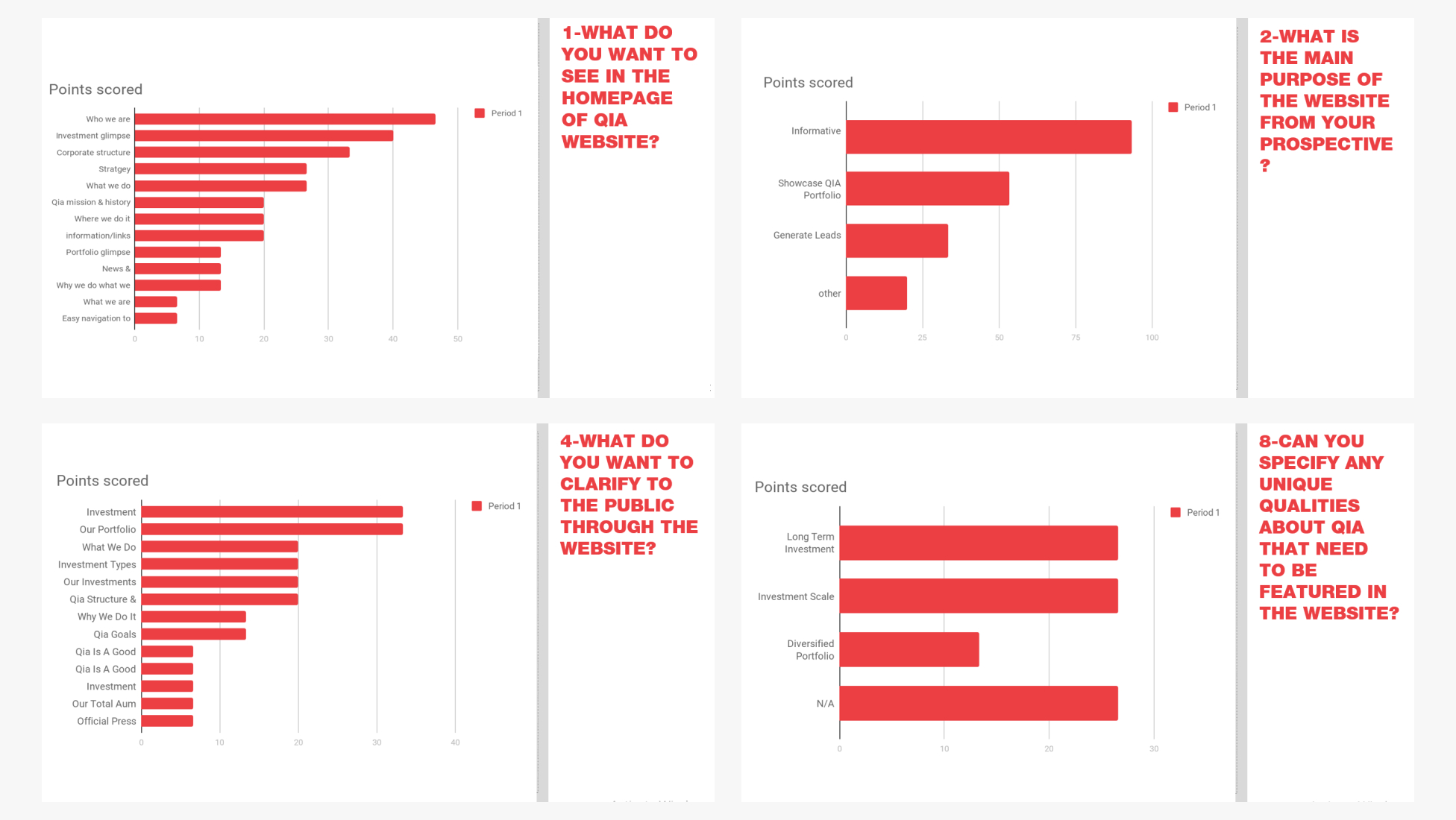
Stakeholders Survey Workshops
In the discovery phase of any new project, it’s important to gather as much information from reliable sources to get a real grasp of the nature of the project at hand. Stakeholder surveys & interviews are one of the best ways to do this. In this survey, there were 15 questions filled by 20+ stakeholders to get an insight into their knowledge & what they want to see on their website. their answers were debriefed and then analyzed to get as many insights from them as possible.
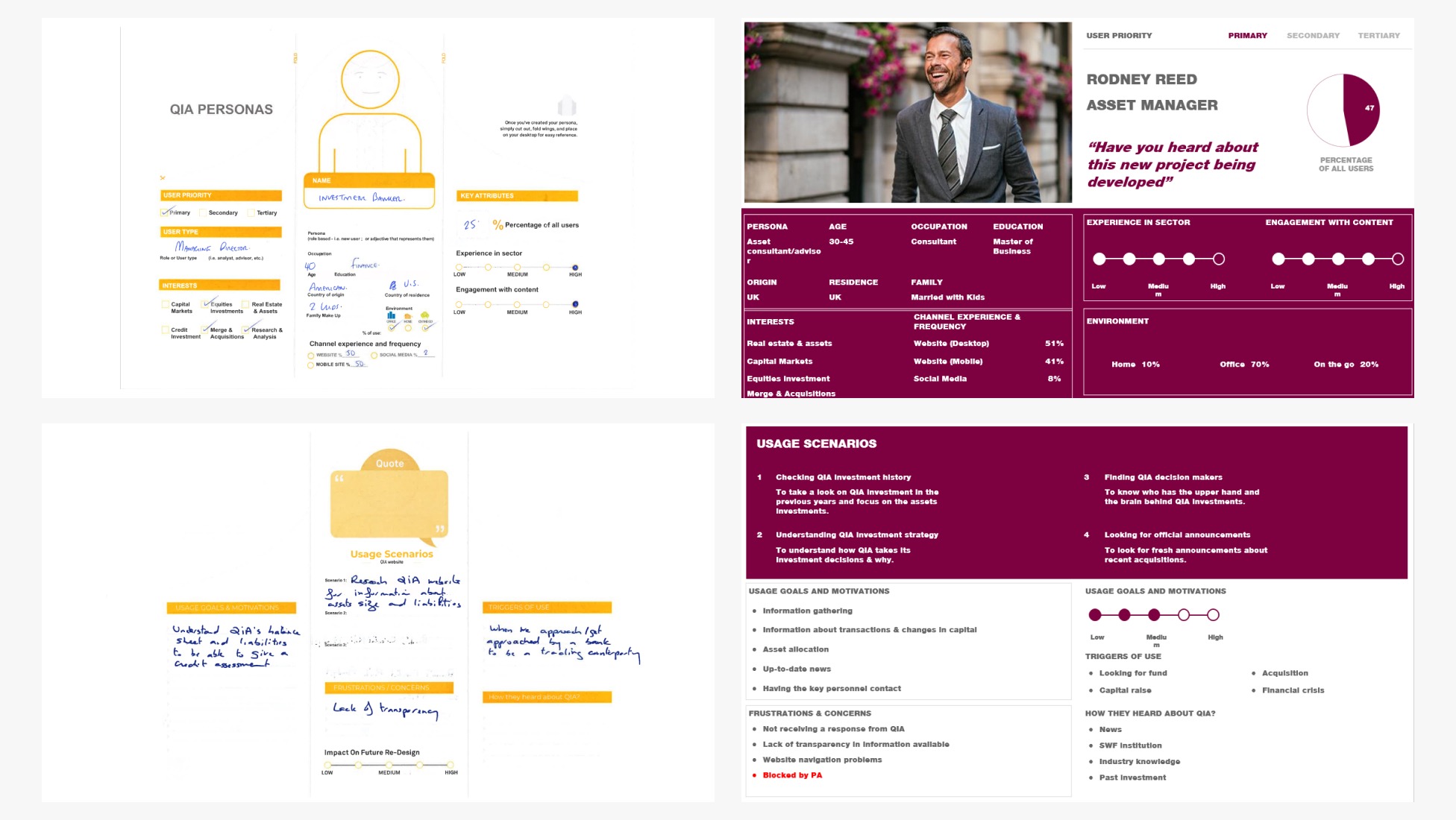
Persona Survey & Persona Construction
User personas in UX serve as detailed, fictional representations of the target audience. The purpose is to create a shared understanding among the design team, ensuring that the end product is tailored to meet the specific requirements and preferences of the intended users. This personas where constructed based on a workshop conducted with various stakeholders to learn from them about the expected user profile for this website then debriefed and analyzed.
Card Sorting Workshop & IA
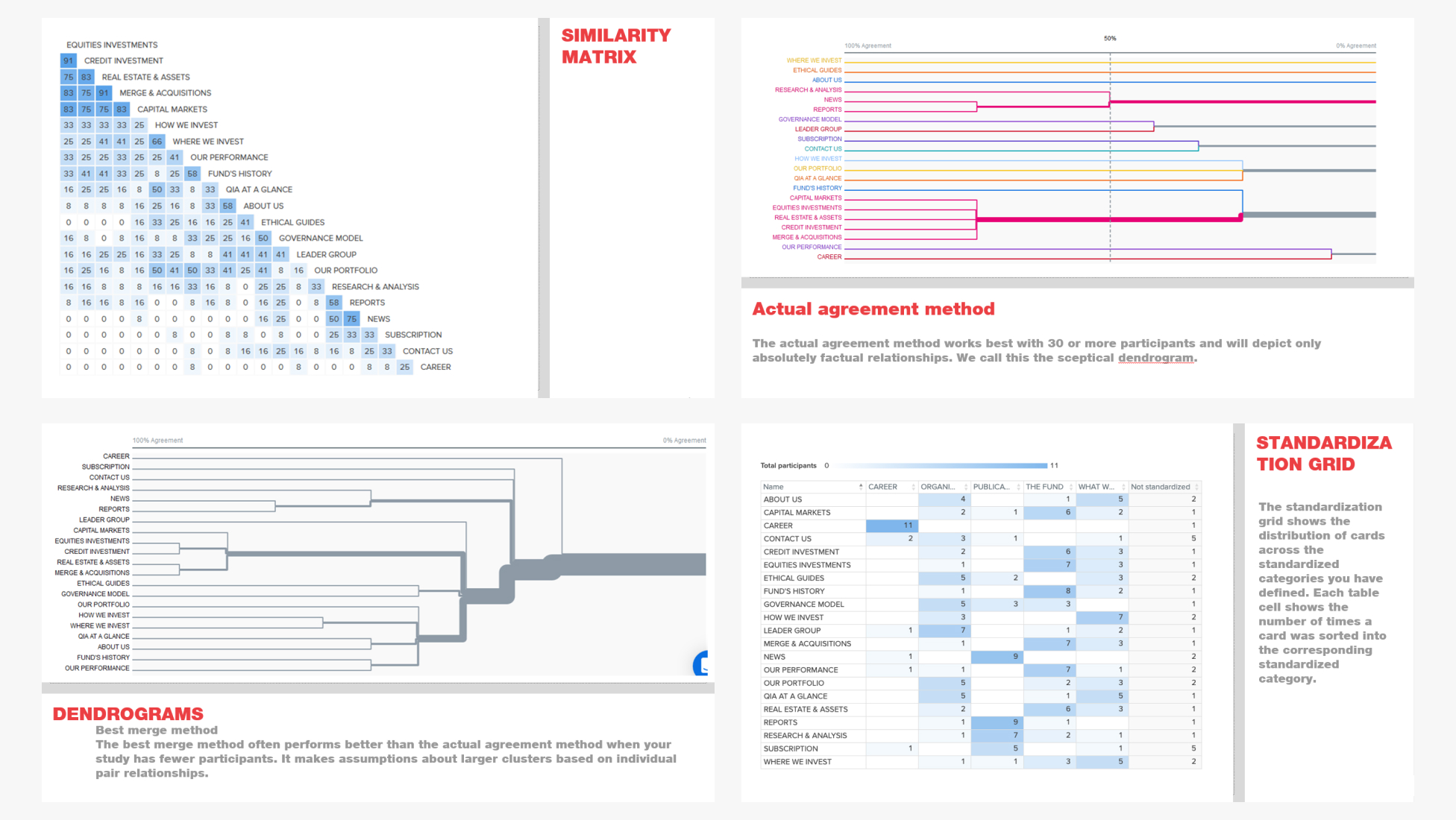
Card sorting is a UX technique that involves users categorizing information on cards into groups that make sense to them. This process aids in building information architecture by providing insights into how users naturally organize and relate content. We did this exercise with a famous web application for UX testing called Optimal Workshop it proved to be a very valuable tool to carry out those exercises.
Project Wireframes
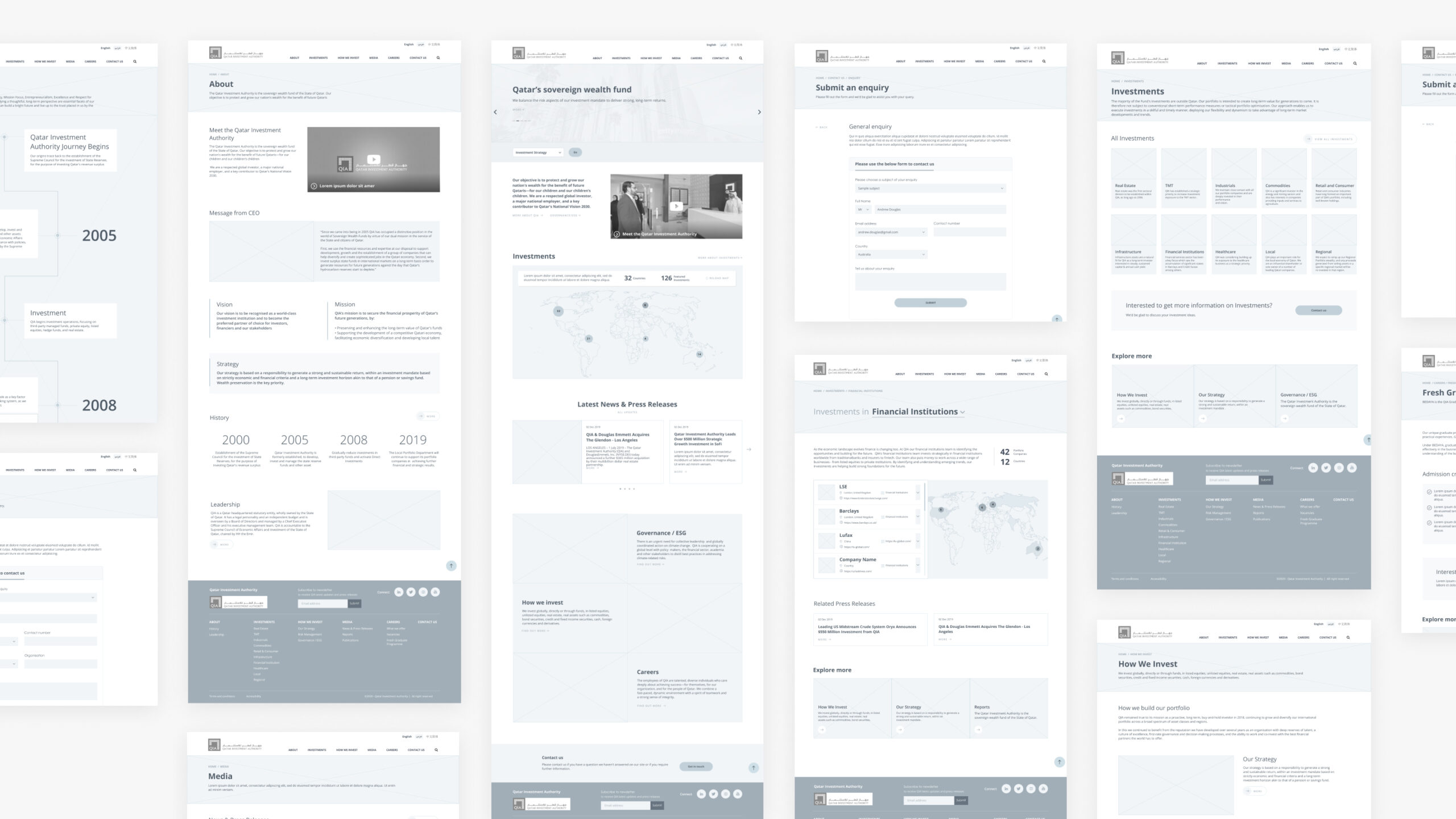
The purpose of wireframes in UX is to provide a visual guide that represents the skeletal structure and layout of a digital product or webpage. Wireframes serve as a blueprint, illustrating the placement of elements, content, and functionalities without the distraction of visual design details. After we got the approval from the client on those after a set of iterations we proceeded to implement the results of all the ux activities into a visual user interface.
Website Design
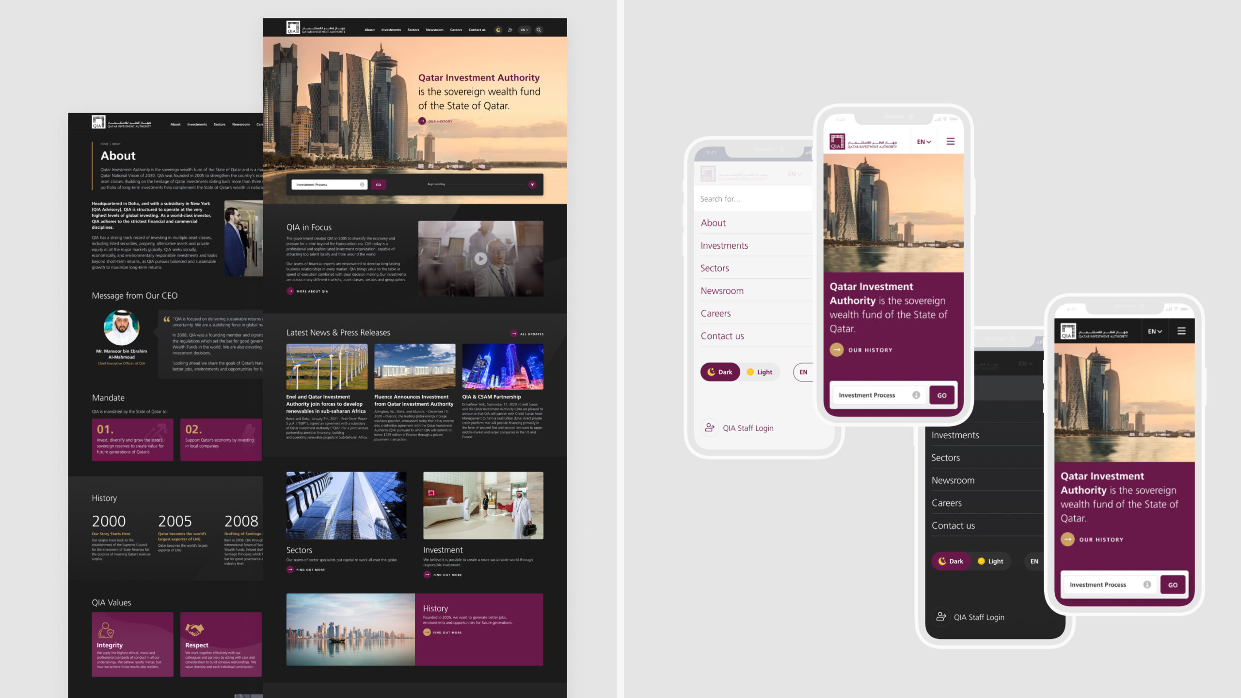
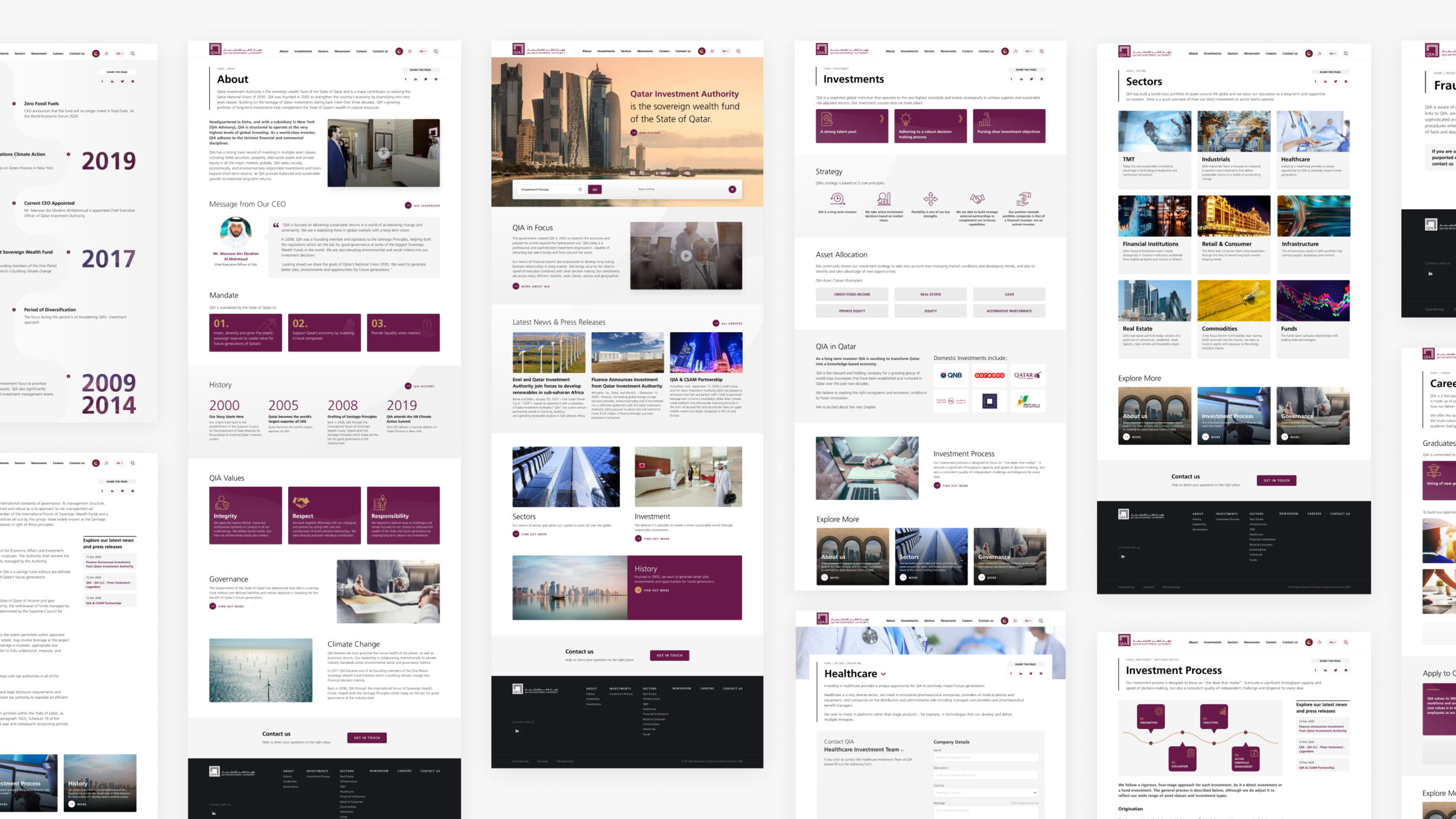
Most designers start with the homepage as it’s the most important part of the website it sets the tone for the rest of the website’s visual style and usually it’s the first part of the project that needs the approval of the client before proceeding with any other part of the website. After designing several options with several visual styles we got the approval on one of the styles and then we proceeded with designing the rest of the website.
Dark Mode & Mobile Design Version
Dark mode are in trend not just for their aesthetics or trendy look but also as they provide nice additional touch for their accessibility enhancing capabilities as some people find it easier to read & grasp content on a dark background instead of a light one. We designed a full mobile version for the website in order for the experience to be suitable to the mobile screen.
